Joëlle Marie Events helps couples plan destination weddings in Italy – mainly Tuscany, offering consultation packages, venue selection services, or premier planning services. With 19+ years of experience, Joëlle was ready to introduce a new brand mark that better represented her company.
In this logo redesign, I focused on conveying Joëlle’s core values of elegance, simplicity, and beauty. From the gentle color palette to the shapes to the delicate lines, the new logo is intricate and graceful yet confident – just as any bride desires to feel on their wedding day. The logo is an extension of the top-quality, personalized approach that Joëlle provides to each client. Following the logo redesign, I continued to support Joëlle with website design by developing the wireframes that were eventually brought to life!
Medium
Adobe Illustrator
Year
2019

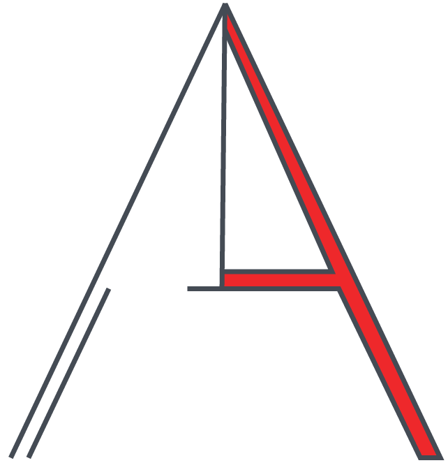
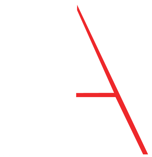
Joelle Events Logo Design
Joëlle Marie Events helps couples plan destination weddings in Italy – mainly Tuscany, offering consultation packages, venue selection services, or premier planning services. With 19+ years of experience, Joëlle was ready to introduce a new brand mark that better represented her company.
In this logo redesign, I focused on conveying Joëlle’s core values of elegance, simplicity, and beauty. From the gentle color palette to the shapes to the delicate lines, the new logo is intricate and graceful yet confident – just as any bride desires to feel on their wedding day. The logo is an extension of the top-quality, personalized approach that Joëlle provides to each client. Following the logo redesign, I continued to support Joëlle with website design by developing the wireframes that were eventually brought to life!
Medium
Adobe Illustrator
Year
2019
MAVO Product Development
In this design, I created a logo and identity guidelines for a (retail or reference) brand. Additionally, I investigated how semiotics, the study of signs and symbols in meaningful communication, could play a role in the development of my logo.
The company was MAVO – an avocado-based (non) dairy line of yogurts and desserts. I strived to create a logo that conveyed a sense of naturalness and simplicity as well as the product components: dairy and avocados.
Medium
Adobe InDesign, Illustrator, Photoshop
Year
2018

UFBERG Logo & Graphic Design
Dan Ufberg, known by UFBERG, brings unmatched energy to his house music sets in his current DJ Community of San Diego, California. Incorporating a variety of house music genres when he performs, UFBERG strives to create a unique experience for every individual at his shows.
As UFBERG has gained traction, Danny needed to establish a professional brand that represents his energy and pushes his career forward. I was given the opportunity to create the complete branding package from logo to social media assets to an EPK. Working closely with Danny and conducting my own research on the music industry, I was able to curate the UFBERG brand through vibrant colors, creative font variations, and eye-catching compositions. The goal was to present a unique look & feel that is both energetic and elegant.
Two final logo variations were developed to accommodate the various formats that UFBERG could featured on visual design assets for venues and events.
I look forward to further iterations to expand the UFBERG brand to more audiences all over the world!
Font(s)
Quicksand, Montserrat
Medium
Adobe Illustrator
Year
2022
PROCESS

SOCIAL MEDIA HEADER

ELECTRONIC PRESS KIT

Playlist Cover Design
In this design, I used a personal music playlist as the starting point to developing a concept-driven image. Using analog and digital intervention methods – including painting mediums on Adobe Sketch – applied to the surface of an image, I demonstrated an ability to problem solve, craft a design with physical materials and digital media, and work within tight physical constraints.
Font(s)
Avenir
Medium
Adobe Photoshop, Illustrator, Sketch, Procreate
Year
2019


Type & Image Integration
In this design, I explored the techniques of fragmenting and fusing using a season’s (Winter) name and working with elements of type, image, and color.
Font(s)
Didot, Futura
Medium
Adobe Photoshop
Year
2019

Prussian Blue Conceptual Poster
This conceptual poster represents the color Prussian Blue. Using dates & facts from the book The Secret Lives of Color by Kassia St. Clair in addition to imagery and textual hierarchy, I was able to tell a story about the development of the color, from its accidental discovery to its overwhelming presence in Picasso’s blue-period paintings.
Font(s)
Futura
Medium
Adobe Photoshop
Year
2019
PROCESS
An exploration of three grid variations: axis of circle, overlapping, concentric circles.


FINAL

Typographic Poster
In this design, I used only fonts and color to create a poster that paid tribute to Nikki Villagomez – a photographer and font enthusiast, who is renowned for her studies the intersection of Culture & Typography.
Throughout her travels, Nikki gathers images from the city’s designers and puts them together to give the inhabitants a vision of their culture as seen through a typographer’s eyes. I used her photographic research in conjunction with a triad color palette to communicate the aged and eccentric style of “found fonts” – old street signs, store fronts, and city art.
The final design is successful in using textual hierarchy and color to communicate a feeling of industrial, old, and unique signage.
Font(s)
Suranna, Bungee Shade, and Lobster Two
Medium
Adobe Illustrator
Year
2018
PROCESS

FINAL
